Interactive Charts with Google Charts
 Vladimir Makovsky, 2015-05-12
Do you agree live charts are more fun? We are going to show you some interactive charts here. In our third blog post, we created simple interactive analytic. Today we build upon this example and just change the UI library, so we will be using:
- UI: jQuery, Google Charts
- Backend: MIA DB, instant-responses analytic database with automatic micro-caching
- Data: Well known projects on GitHub, data are loaded to MIA DB from GitHub every hour
Google is known for its obsession by a speed and they have deep know-how in scalability. So from many charting libraries that exist I decided to use their library afterall it is used by Google itself and you get battle-proven technology. We will focus here just a bit on the user experience of the library. First impressions of the library are:
- well documented, many examples, easy to start with
- highly configurable, many out of the box functions
- scales well in terms of many data points
- free for usage, but requires the Internet connection, the source code is not available
The API is well documented and you can start playing with the library just by copying & pasting the examples into an HTML file. For each graph, there is a plenty of options and you will see a few that may be handy.
Pie chart
Following pie chart shows proportional number of commits by a particular author in a selected month.
When you change the project name or the month data for the chart(s) are pulled off into the graph over xhttp requests directly from a database every time (you can press Ctrl+Shift+I in FF, Chrome to check network traffic). Every time whole graph is redrawn from the incoming data.
On an ordinary laptop drawing up to a thousand values in a pie chart is a piece of cake for Google charts. There are no noticeable delays (eg. choose Linux repository from a drop down menu). When there are too many small (non-significant) areas they are automatically squashed into 'other' section. That's quite nice out of the box feature. When a graph legend is too long it's paged automatically.
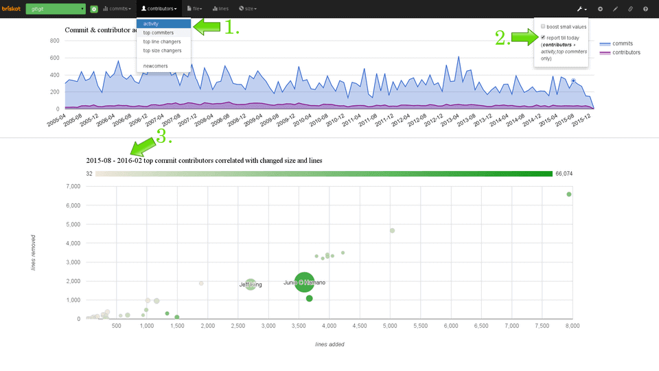
Scatter chart
In a scatter chart and a bubble chart, you will notice some slight delay, but still it's quite fast even for a decent amount of data points.
Bubble chart
In graphs with the continuous x-axis, there is an option called explorer. It allows users to pan and zoom Google charts. It is very handy in case you have many data points and limited drawing area. Try to select a different date in the below bubble chart and zoom in and out:
Column chart
Line chart and column chart are quite simple graphs so drawing thousand values is pretty quick. You can try animation option in the following graph.
This effect allows to have nicer transitions when loading new graph data. But it can be used as a technique to delay requests coming out of your UI application, which means your server can handle more concurrent users.
Dashboard
Hopefully, we showed that using interactive graphs, you can build pretty
fancy pages. In the end let's
more sophisticated dashboard using google graphs: