Eine Kleine Git Analytik
 Vladimir Makovsky, 2015-01-27
In the previous post, we have outlined one possible approach on how to build interactive analytics for a huge amount of users around the globe. It's time to make some real example. We will show you a tiny application with real data.
 GitHub
For our application, we chose GitHub. GitHub is one of the best places to host a software project. It's fast, efficient and available to anybody. There are over 17 millions of both commercial and public repositories with over 2.5 million users, most of them are software developers. The whole site is managed by 240 employees. Now I can tell you an interesting fact. Every reader of this blog post knows a company that uses software which can be found on GitHub. That is a trivial fact because our web pages use Bootstrap and Jekyll. And these web pages are hosted on GitHub as a public repository. Enough of silly jokes and let's get back to analytics.
The most watched software projects
Software repositories on GitHub are a good choice for our use case. The users are spread around the globe. One of the biggest repositories is the Linux repository. In total it has roughly 15000 authors, 0.5 million commits, 50000 files and 0.5GB in total size (though the Linux was started in 1991, the Linux git history only starts from 2005 so it could be quite bigger). If you want to be able to count statistics after each commit and each file, your fact table, in this case, will have just 1.2 million records. All other repositories in the top ten most watched GitHub repositories have less than 50000 commits.
So the data are not that big but satisfactory for our purposes. This example should also show that there are a lot of interesting "small" data around that are just not used as well as they could be. And one of the reasons why they are not utilized better is the technological and cost barrier. Surely, other examples come to my mind.
Gitcharts - basic git analytics
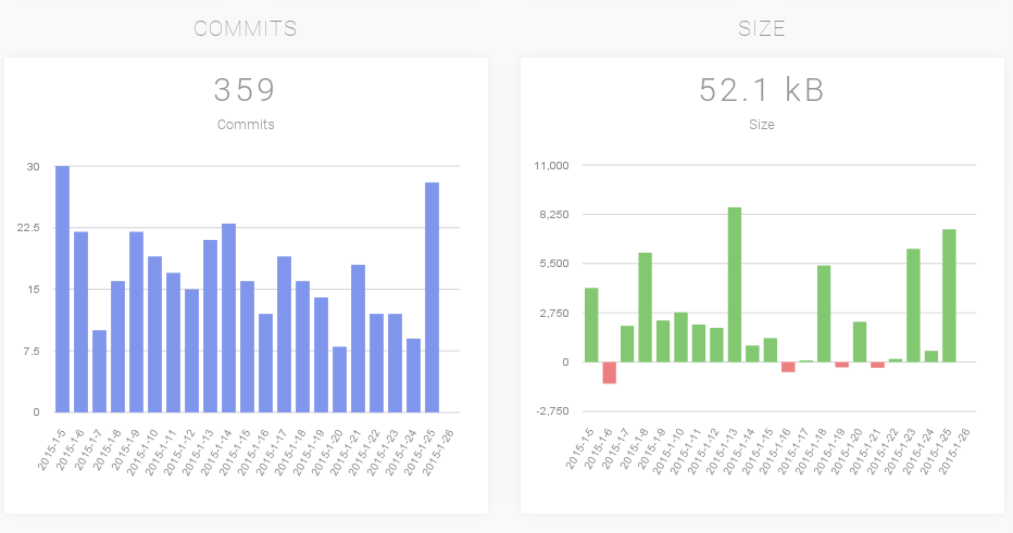
We have picked among the most watched projects and some other eg. like PostgreSQL. The UI of Gitcharts was developed in Ember.js, Bootstrap, and morris.js charting library. The application starts with the summary report:

We track just the main branch of the project's repository. We don't differentiate between regular and merge commits. Number of files and repository size are just approximate numbers. They are counted from regular commits only. I.e. if your branch includes a lot of merge commits it will differ. Especially if you merge from remote branch it can differ up to 50%. But most of the listed repositories have less than 10% error - it's still better to show an approximate number than not to show anything. To show exact numbers, we would need non-trivial post-processing in ETL.
All other reports show statistics for the last X days:


Latency
The backend server itself is located in Ireland. We did not replicate it to other locations although if there is an interest we can do it. But for now if you are in most of the Europe or on the US East Coast you should barely notice the network latency. However, from more distant locations the network delay may be much more noticeable. Similarly with the UI, in this case you can actually reckon some time lag. More low-level charting library would be required to reduce the small lags.
Resource efficiency
We run gitcharts application on m1.small instance. It has 1.6 GB RAM with 1 AWS compute unit, which has actually more than two times smaller computational power than an average nowadays laptop. You can put there quite comfortably 20 interesting repositories.
There are no data cached on the client side neither they are on the web server. With each change of the slider, 4 parallel requests are triggered. The database executes the reports or hit automatically created micro-caches and returns the response. We created simple stress test which you can see in the following video.
As you could see, in the video very nice feature is that the UI client can make synchronous requests only. Sure, sometimes the client has to repeat the request, but with this feature we were able to make the stress test by using simple wget utility.
High throughput
We have also shown in the video that even on a small computer you can serve decent amount of concurrent users. In this case, you can serve ~50 different users or 50 changes of the slider on 16 different projects within one second. That's ~4 million changes of the slider a day.
Ok, if you add more complicated reports and refresh the data more often - it will be less. Nevertheless not that much, I cannot tell the precise number - as the factors influencing the speed are so complex that each scenario needs its own measurement. We are quite confident regarding the performance because of the architecture and the experience.
We have seen the differences in the number of requests served during the day. It is because the hosted machine on AWS is not a fully dedicated server but runs as a virtual machine. So it gets affected a little. During different days and different phase of the day we have seen the numbers ranging from 43 to 53 users served within a second.
We have demonstrated that with only small effort you can build interactive analytical application and effectively utilize computer resources. All of that is achieved without any tuning of any query. Simpler application design without specialized tuning allows to cut the price significantly.