Housing Market Graphs and Maps - 2015 vs. 2007
 Vlad Makovsky, 2016-04-26
In 2007, the U.K. experienced a housing bubble burst. In this post, we are conducting an analysis of the England and Wales housing market before and after 2007 untill 2015. Graphs and heat maps are generated from HousePAd application using Land registry public dataset. This dataset includes nearly all residential property transactions in England and Wales since 1995 (Scotland and N. Ireland are not publicly available). We show raw, no inflation-adjusted numbers.
1995 - 2007 insane property price growth
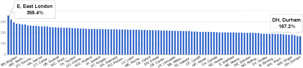
Every year from 1996 to 2007, the average property price grew between 5% and 16%. In this period, all postcode areas multiplied the average price more than 2.5 times. The area with the lowest price growth, Durham, grew by 167%. It went from £50k in 1995 to £135k in 2007. The area with the highest price growth - East London - grew by 355% - from £61k in 1995 to £278k in 2007.
House price percentage change by postcode area - 2007 vs. 1995
2007 market crash
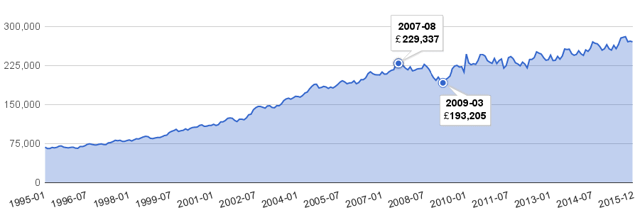
After 12 years of growth, the average property price peaked at £229k in August 2007. For the next one and half years, it stagnated or it was on a decline:
Monthly average house price from 1995 to 2015
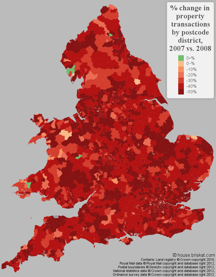
While the price drop was relatively small, the drop in sales volumes was much more significant. Total house sales fell by 49% between 2007 and 2008. It is clearly shown in the following heat map:
In the five-year period following 2007, the sales volumes were down by 47%:
| Year/Period | Property Transactions |
|---|---|
| 2003 - 2007 | 6.2M |
| 2008 - 2012 | 3.3M (- 47%) |
To get a better picture of changes during the 2007 housing market crash, we can correlate house price percentage change and percentage change in housing transactions (bigger circle means more transactions):
Correlation of house price % change and % change in housing transactions
by postcode area - 2008 vs. 2007
click in the picture
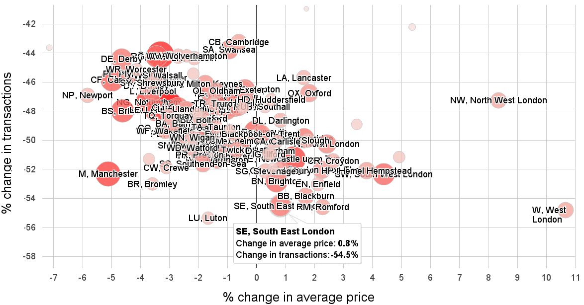
From the graph above, we can see that while transactions were down by tens of percents in all areas the average property price dropped by 7% at most. Eventually, the price was still on the rise in many other areas. It shows the housing market resilience. Although the transaction volumes fell off a cliff properties were still holding their value.
Sales volumes recovery
A number of transactions for a month was above 80k for most of the year from 1997 to 2007. After 2007, this number wasn’t reached until August 2013:
Number of property transactions by month
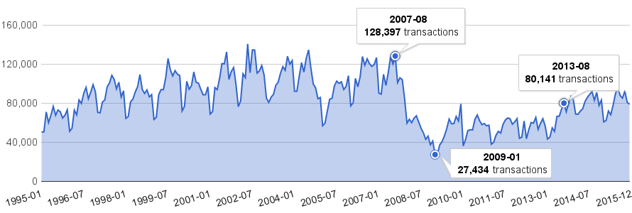
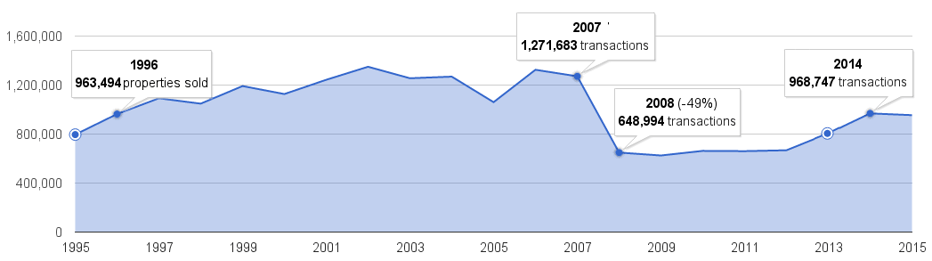
A number of transactions in 2013 and in 2014 replicated the numbers from 1995 and 1996 but were still much lower than pre-bubble numbers. 2015 transaction levels were still 25% below the 2007 levels:
Number of property transactions by year
Comparing 2015 to 2007
From 2007 to 2015, the average house price changed quite differently based on postcode areas:
House price percentage change by postcode area - 2015 vs. 2007
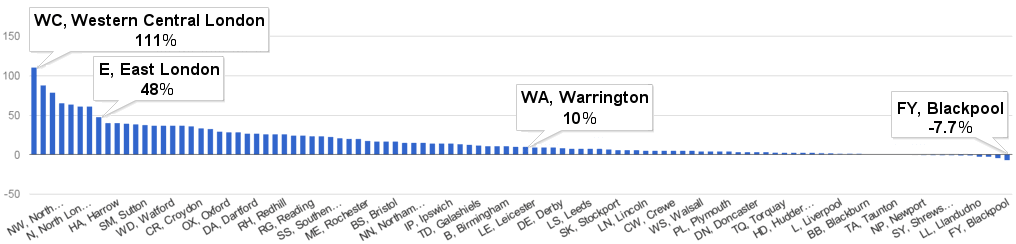
Not surprisingly, the top 8 fastest growing areas are from London, with East London closing. On the other hand, more than half of the areas didn’t grow by more than 10%. A few areas were still below 2007 price levels (and we used the raw numbers). When we display the previous report on a heat map, we can see the growth is geographically linked (there are no lines drawn between the areas so the map looks smoother). For a more detailed view, we also added heat map by postcode district:
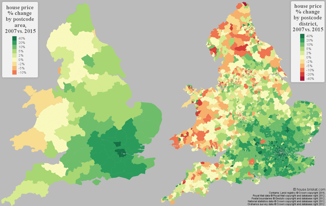
While the prices kept growing in Greater London and adjacent areas, the areas in northern England and in Wales were on or below 2007 price levels.
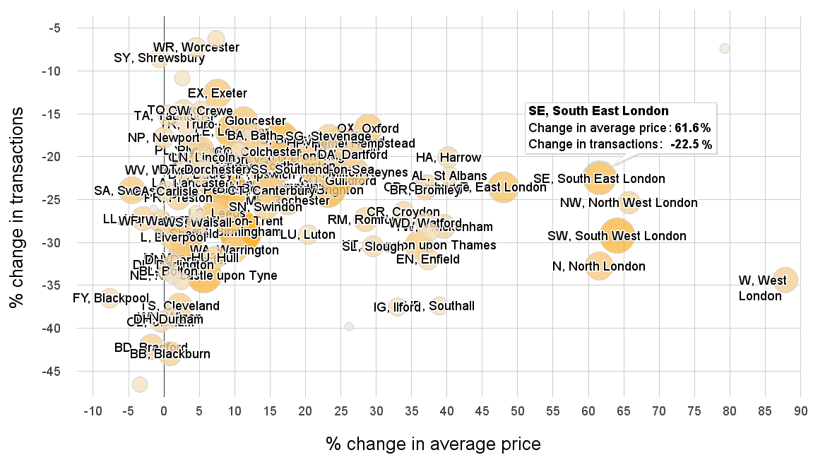
The correlation graph reveals the relation between house price percentage change and percentage change in transactions:
Correlation of house price % change and % change in transactions
by postcode area - 2015 vs. 2007
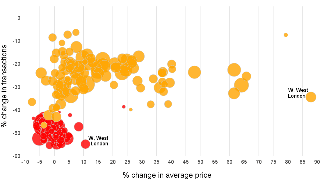
To see how the housing market changed from 2008 to 2015 in relation to 2007 we can combine previous correlation graphs into one:
Correlations - 2015 and 2008 compared to 2007
Where are we?
Many areas experienced a price correction of unsustainable price growth and their average prices was stagnating since 2007. The sales volumes in 2015 are still one-quarter below the volumes during the bubble peak but back on pre-crash transaction volumes.
London and its adjacent areas were influenced by the bubble much less than the rest of the country and continue in prices growth. The question is, for how long - only time will tell.
Images license: © house.briskat.com, Land Registry © Crown copyright 2016